May 29, 2008
By JOSHUA BROCKMAN
The down-on-its-luck U.S. dollar now faces the prospect of a significant makeover.
Last week, a federal appeals court ruled that the United States discriminates against the blind by producing currency that visually impaired people cannot recognize without the assistance of others.
If upheld, the ruling could force the U.S. to overhaul the look and feel of its currency. It might take its cue from a host of other countries whose bank notes already incorporate shapes, colors and even textures designed to help the visually impaired distinguish between denominations.

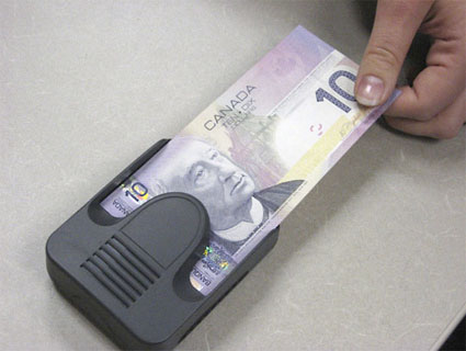
Canadian bills are compatible with a hand-held electronic bank note reader, provided free by the Bank of Canada through the Canadian National Institute for the Blind. The reader can announce the denomination, beep or vibrate a code representing the denomination. Courtesy of Bank of Canada.
In Europe, the euro’s paper currency features large, raised numerals and foil elements, and longer notes connote higher value. In Japan, new designs for the yen incorporate tactile elements. In England, the size of pound notes correspond to their value – 5, 10, 20 and 50; the 20-pound note issued last year has large numerals and raised text on the front.
A series of Canadian bank notes, issued in 2001, has four design features catering to a range of users, including the blind and senior citizens.
Five distinct colors help the visually impaired distinguish Canadian bills from one another. Large numerals are presented in high contrast: One side of the bill has a dark number on a light background; the other side has a light number on a dark background. The bills also have a tactile feature: raised dots in the upper right corner that correspond to specific dollar amounts.
The bills are compatible with a hand-held electronic bank note reader, provided free by the Bank of Canada through the Canadian National Institute for the Blind. The reader can announce the denomination in English or French, beep a code representing the denomination or even discretely vibrate to indicate the amount.
The reader’s multiple features address a leading cause of blindness among older people: type 2 diabetes, which can also cause loss of sensitivity in the fingers, says Charles Spencer. The former director of currency development for the bank, Spencer now directs its strategic leadership team.
“This is a pretty broad approach, and it has to be, because there are a lot of different needs,” says Spencer.

Raised dots in the upper right corner of Canadian bills correspond to specific dollar amounts. This tactile element, pictured on a Canadian $20 bill, is one of four features that help the blind, visually impaired and senior citizens identify Canadian currency. Courtesy of Bank of Canada.
Making the Greenback Accessible
A 1995 study by the National Research Council found that bank notes in the United States were “remarkably uniform in size, color and general design,” creating an obstacle for the blind. Since 2003, the $5, $10, $20 and $50 bills have been redesigned with different background colors, largely to improve security. In March, the Treasury Department began circulating a $5 bill with a larger number in the lower right corner printed in purple ink.
Some people with low vision do benefit from the change to the $5 bill: “It’s a good step,” says Melanie Brunson, executive director of the American Council of the Blind, which sued the Treasury in 2002. “But it’s not enough to address our concerns.”
Last week, the U.S. Court of Appeals for the District of Columbia agreed.
In a 2-to-1 decision, the appeals court affirmed a district court ruling requiring the U.S. to redesign bank notes with accessible features for the blind and visually impaired. This ruling puts the case back in the hands of the lower court to decide what measures the Treasury must take to revamp the dollar.
Circuit Judge Judith Rogers wrote that the Treasury’s failure “to design and issue” currency that is “readily distinguishable” to the blind violates a 1973 law that bars federal programs from discriminating against someone with a disability.
A spokesman for the Treasury Department says the case is under review. It has the option to appeal to the Supreme Court.
“Treasury has been working to improve the nation’s paper currency to best serve the needs of all Americans, including those who are blind or visually impaired,” Treasury spokesman Brookly McLaughlin said in an e-mail response to NPR. The Bureau of Engraving and Printing has initiated a study — slated for completion in early 2009 — to assess the best methods for assisting this population.
© NPR
